Smoking Cessation Scheduling
Client: CVS Health | Duration: 3 Months | Role: XD DesignerCollaboration: XD Designer (Dan Staton), UXR (Laura Paradis), A11y (Charles Hall), CD (Mitch Krpata), Engineering, Development, Product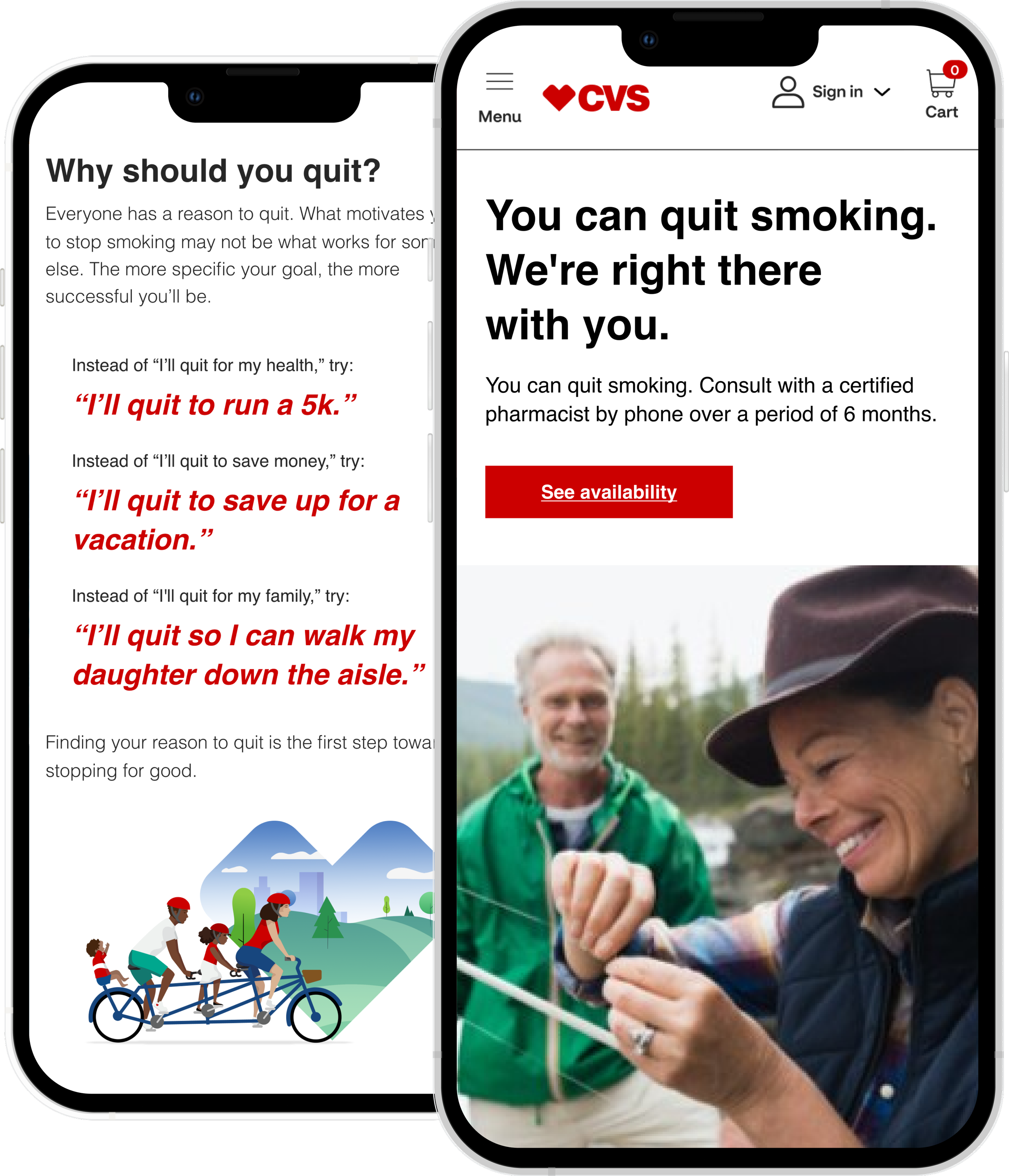
OVERVIEW
CVS Smoking Cessation is a 0-to-1, end-to-end responsive web scheduling 6-month pilot program launched in Indiana, Missouri, and Tennessee. This program helps patients finally quick smoking cigarettes and vapes with the help of their trusted CVS pharmacist.PROBLEM
Creating a net new smoking cessation program scheduling flow and marketing landing page for the pharmacy side. CHALLENGE
Help smokers, especially those who have struggled to quit, change their perception and trust the CVS Pharmacy Smoking Cessation program. Reducing user fatigue caused by an overwhelming number of registration questions. IMPACT
Launched a scalable scheduling flow with planned state expansion.Optimized registration process.Reduced drop-offBuilt trust through thoughtful content and UX messaging.Shifted motivation by focusing on user goals, not just health risks.
Design Process
Research & Structure
Studied competitors and designed a more supportive, motivation-led experience → no fear tactics.Conducted user interviews to uncover needs and motivation barriers.Applied IA to transform a dense questionnaire into a simplified registration flow.Mapped user flow for in-store / phone consultations
Design & Iteration
Created wireframes → lo-fi → hi-fi prototypesRan A/B tests and gathered user feedback to reduce cognitive fatigue.Iterated designs to improve clarity, motivation, and task completion.
Delivery & MVP+
Delivered a net new in-person + online scheduling flow program.Designed MVP+ features, including cancel + reschedule functionality.

INFORMATION ARCHITECTURE
Analyzing and categorizing 60+ questions from legal
To reduce question overload, each item was reviewed for necessity vs. mandatory status, then organized by page and grouped by type like patient info or medical history. Questions were also sorted by flow type (all flows, in-store, or phone). Internal labels, such as state-regulated terms, helped streamline design and dev handoff to avoid duplicate work.USER FLOW
Online or in-store program participation
After registering online and meeting eligibility, users must attend follow-up visits to stay in the program. All in-person consultations must occur at the pharmacy where registered.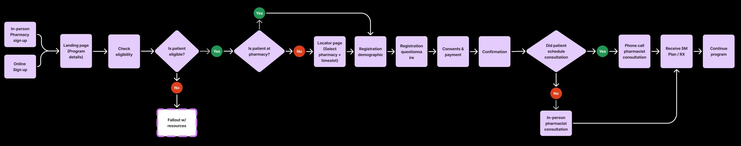
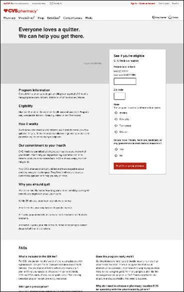
LANDING PAGE EVOLUTION
Early designs laid the foundation, but user insight helped transform the experience into one that encourages and supports change
1st: Lo-fi design basic structure of page / widget2nd: Utilized in usability testing to evaluate program clarity and eligibility3rd: Content and design started coming together


Research
USER INTERVIEWS
Users experiences with quitting
Interviews explored patient experiences with quitting, including what strategies helped and where they struggled. Many found the ritual of smoking harder to give up than nicotine itself. Feelings of shame often prevented them from discussing it with doctors, and quitting was more successful when tied to a life goal rather than general health concerns.
USER TESTING
Bridging user expectations and product reality
Usability testing was conducted that explored perceptions of the program, preferences between in-store and online registration, and clarity of content. While users found the flow easy to understand, many felt overwhelmed by the number of questions and expressed hesitancy about the program being pharmacist-led.User pain points
PAIN POINT 1: TRUST
Users were initially hesitant, but eventually became more hopeful
Fostering trust with factsAdding pharmacists' credentials combined with CVS stopping cigarette sales in 2014, this built trust and reduced skepticism.
Developing a new perspectiveUsers felt hopeful seeing health improvements after quitting within a specific time frame.Appreciated the landing page's lack of cigarette or triggering images, unlike other sites.New design motivated users to stay committed to completing the program.


PAIN POINT 2: REGISTRATION
Extensive discussions with the legal team resulted in splitting the lengthy registration questionnaire into three digestible intake forms
“Tell Us About Yourself”: Demographics, patient info, and primary care provider contact.“Tell Us About Your Quit Goals”: Goals, smoking history, and related questions.“Let’s Complete Your Registration”: Consents, payment, and acknowledgments.


PAINPOINT 3: OVERWHELM
Registration Progress Indicator
Redesigned a lengthy registration flow that had no clear end in sight by adding visual progress indicators to guide users.
DESIGN ITERATION FEEDBACK
Refining the Experience Through A/B Testing
Users had no clear sense of when registration would end, so a progress indicator (“Page X of X”) was designed to help set expectations and show how long the process would take. It was tested alongside variations in button language, visual design, and a step-by-step outline. Users preferred Version 2, responding positively to the added clarity, visuals, and ability to better anticipate what came next.


BUTTON CONTENT
Descriptive buttons set clear expectations for users about what was coming next
Users struggled to recall the next steps with an intro page or instructions at the top. Placing it at the end helped set expectations and clarify the time needed to complete registration.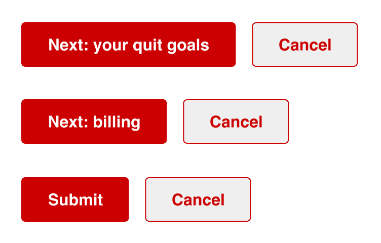
PAIN POINT 4: ELIGIBILITY / RESOURCES
Even as a pilot program with limited access, users should have had full access to the resources they needed.
With full support from the product team, I added helpful resources to landing pages and confirmation points to prevent users from hitting a dead end.

PAIN POINT 5: CANCEL / RESCHEDULE
Without the autonomy to reschedule appointments, users had to restart the full registration process just to make a change.
Display appointment Pre-booking: Adding a “Edit” link to appointment information sectionPost-booking: Allowing users on confirmation to “reschedule” without starting registration over (In-progress)

Final screens

LAUNCH
Smoking Cessation pilot launched successfully in Indiana, Missouri, and Tennessee, with expansion underway. Launched under a tight timeline, the MVP was followed by enhanced experience designs that gave users more control over managing their appointments.
Really proud of the Smoking Cessation project. It was about more than just quitting; it gave people hope and a fresh perspective. Hearing users’ stories helped us understand their concerns and shape the product into what it is today.Dan Staton, UX Designer